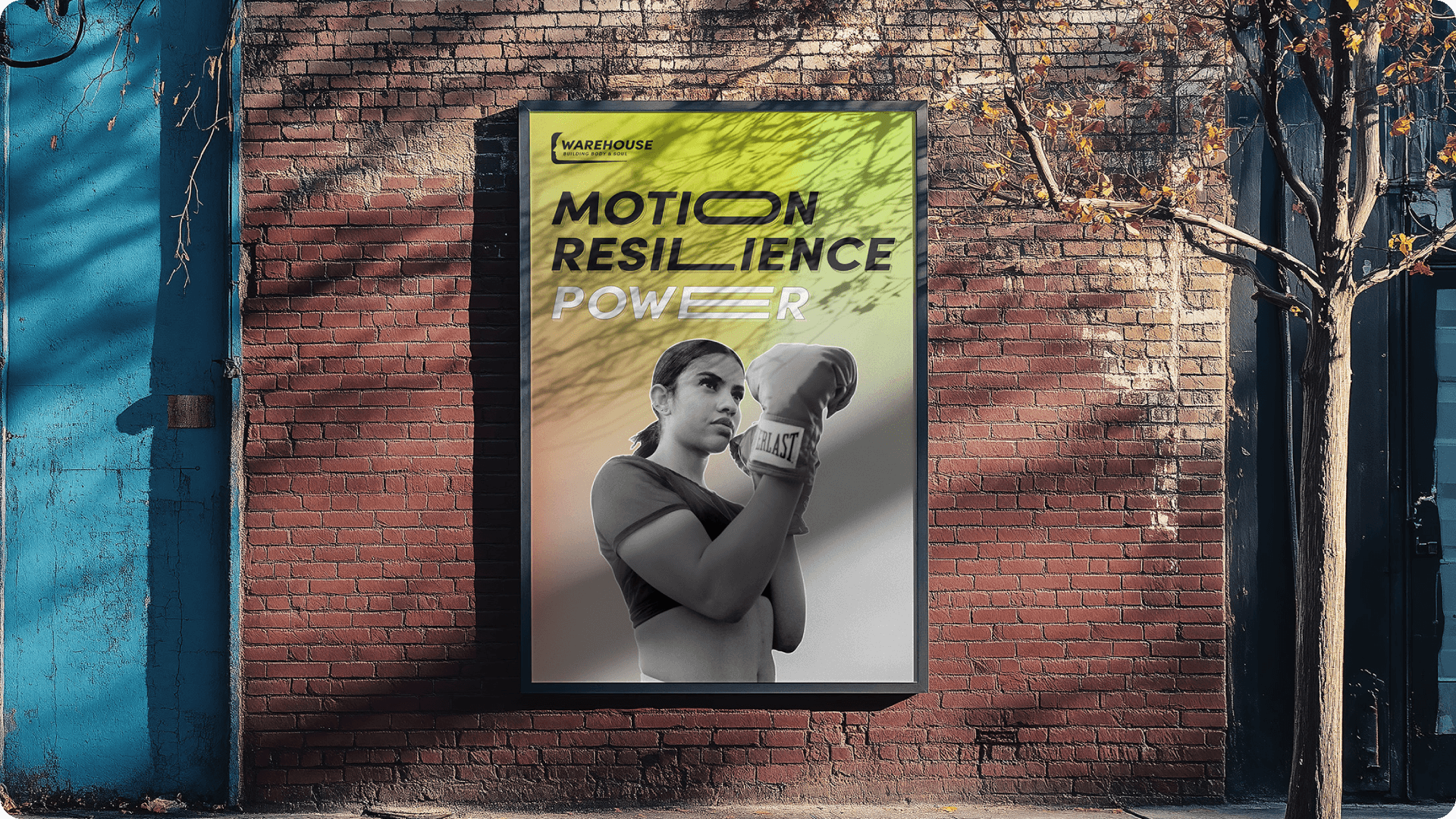
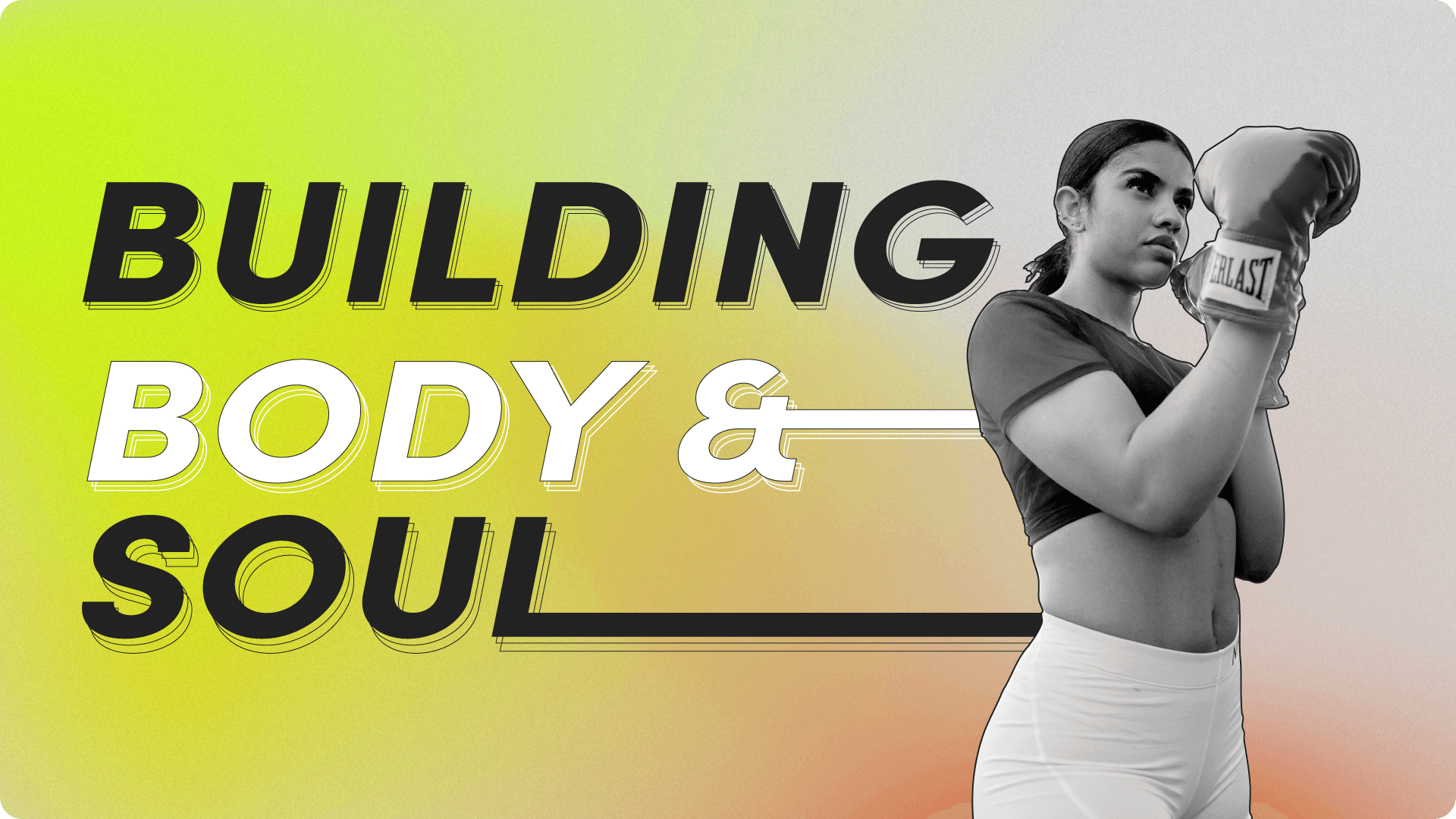
The Warehouse is a community project focused on mental and physical strength. I was tasked with creating a brand kit that balanced self-defence with mental well-being, led by the message ‘Building Body & Soul’. The result combined urban graphics and bold typography with warm tones and a mindful logo
Assets Produced: Brand Guidelines | Social Media pack
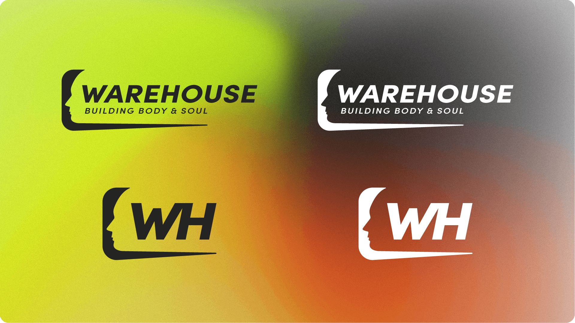
Primary & secondary logos were designed in collaboration with the founder - a silouhette head was crafted to signify open-mindedness, whilst the typography represents movement and agility.
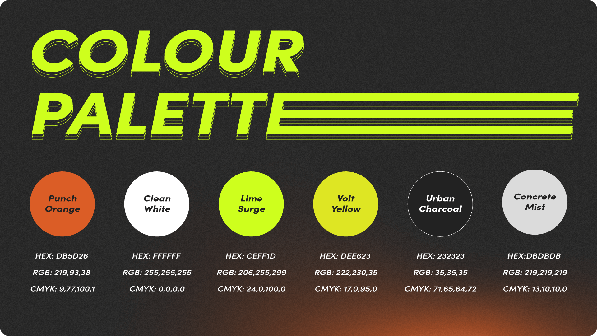
The bold palette reflects the brand’s balance of body and soul. Neutral tones were added to bring clarity and structure, while green, yellow, and orange suggest energy and strength.
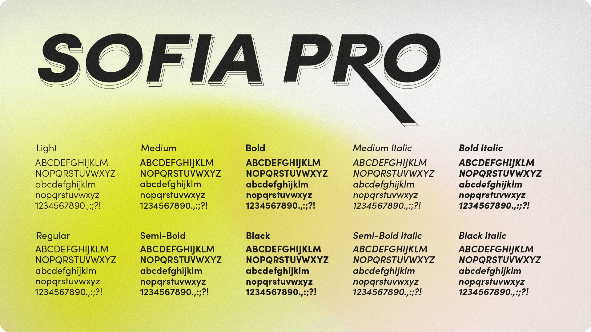
Sofia Pro, a clean sans serif, was chosen for its accessibility and versatility.
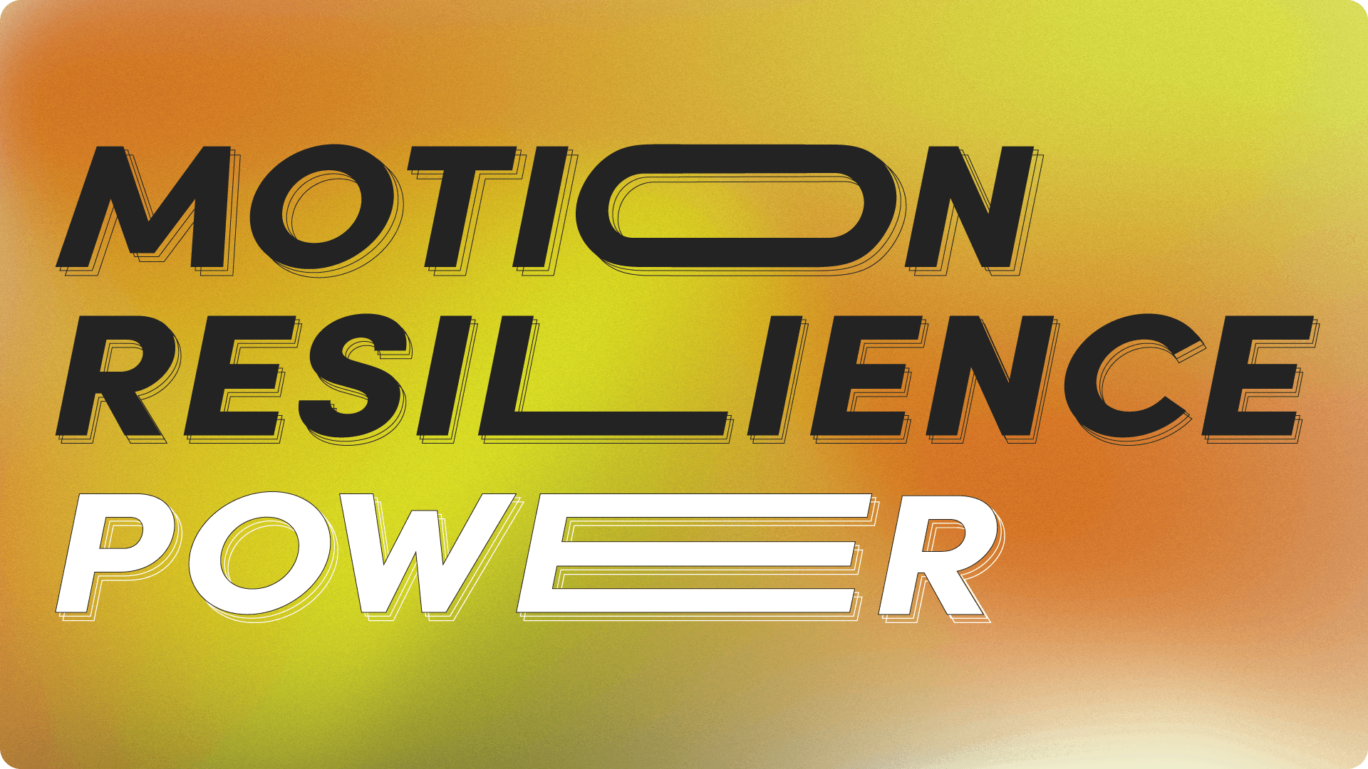
Large stylised typography was added as a key branded element to communicate agility and strength.
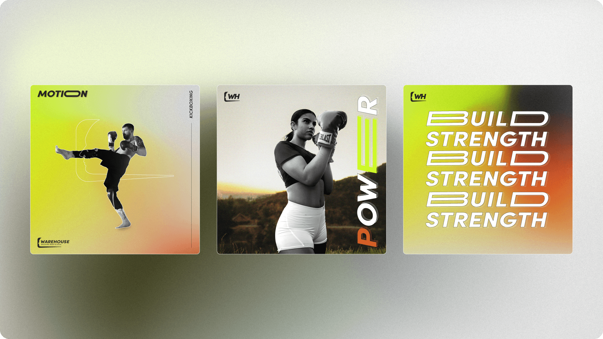
Examples of social media styles that incorporate a variety of branded elements for a consistent look and feel.